How does Gmail continue to delight it’s users?
This year, Gmail turned 18.
What started off as Paul Buchheit’s side project in 2004, now has over 1.5 billion users and is available in 100+ languages.
Yet despite it’s tremendous growth, the product continues to find new ways to delight its users, deliver great experiences, and continues to build new innovative features.
How does the product team do it?
To help us unpack this question, I interviewed Matthew Izatt, Product Lead for Gmail.
Matthew has been building and growing Gmail for the last 10+ years. He started off in mobile where he built the Android and iOS apps for Gmail, and eventually he became the lead product owner for all of Gmail’s front end.
He also led the development of the new Gmail in 2018, which was a complex rebuild of the technical architecture and visual design, along with the addition of multiple enterprise focused features.
Since then, he has been leading Google’s charge on redefining how we work as the product lead for the Workspace Platform and Partnerships efforts with a team of over 100.
What follows is a lightly edited version of our interview.
Matthew, thank you for joining us. Now, before we jump into how your team does its magic, can you please share with me some of the challenges you face when you build a new feature or experience on Gmail?
Matthew Izatt: Thanks Mustafa. And I think this is a great place to start.
One of the biggest challenges is that Gmail is used by over 1.5 billion users, and while that is great, there are many different ways of using our product. It’s not like a doorbell, where there is only one way of using it. With Gmail, it’s like an infinite Swiss army knife, where everyone has their own favorite way of using the product.
Second, Gmail is a critical product for many of our users. Yes, it’s fun to use, but people use it to get important work done—sending job proposals, emailing with their kids’ teachers, or booking medical appointments. This is why we have to be careful about what we experiment with and what we roll out. We can’t just throw things out there and see what works. We have to do our homework.
Third, we have to constantly innovate and think outside the box. Email is an old product, but it continues to evolve. Every day we have new startups reinventing email and challenging the big players. If we are to remain a market leader, we literally have to rethink the product every few years. Which is why creating the new Gmail was so much fun.
I don’t envy you. This is not an easy product to build. Going back to something you touched on: Given these hurdles, how do you build these great experiences? Is there an example that you can share with us?
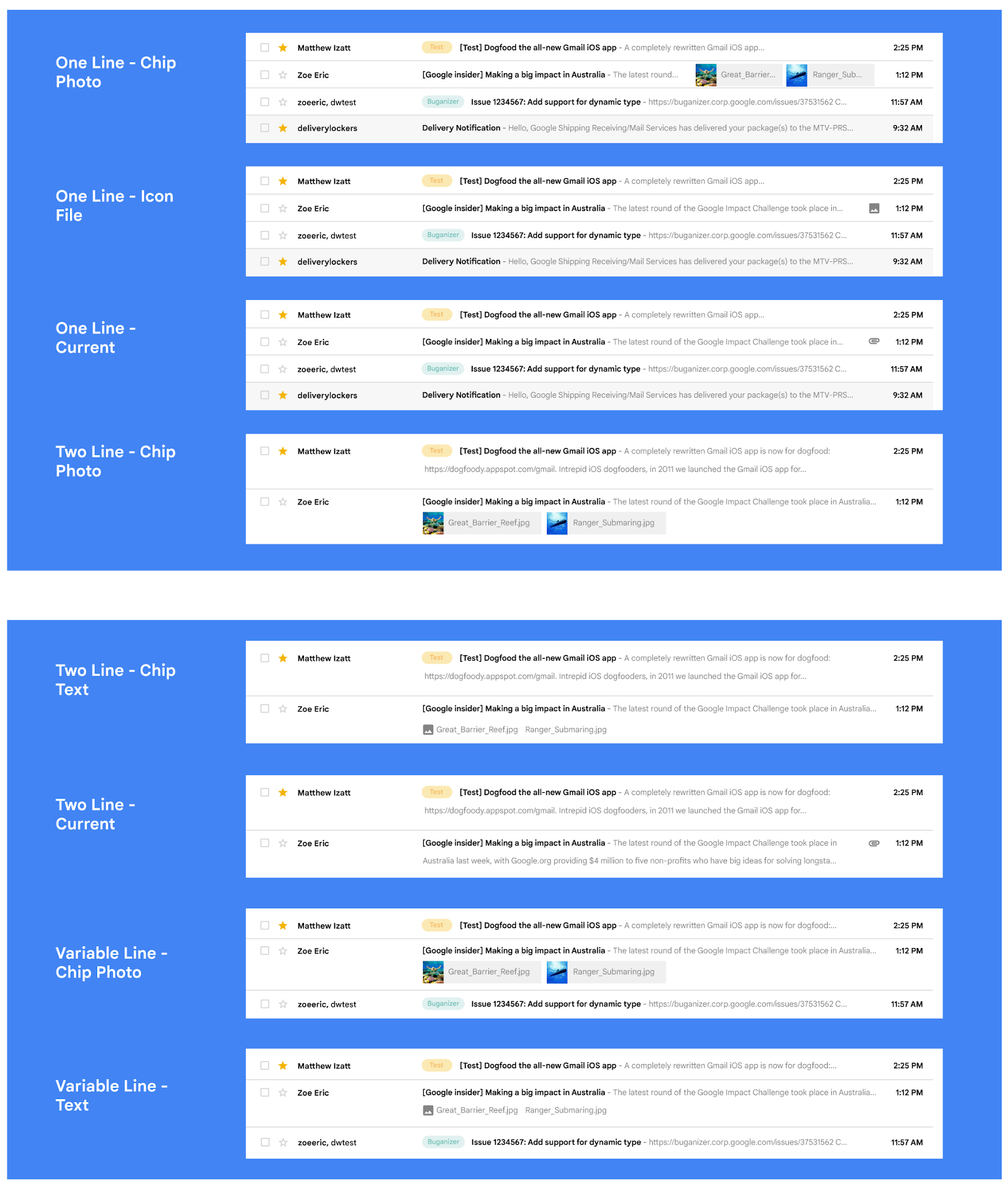
MI: A specific example I always like to share is the story of how we came up with the right display density on our thread list. The thread list is your inbox; it’s the list of all the messages that you have. The display density is how that information is presented to you.
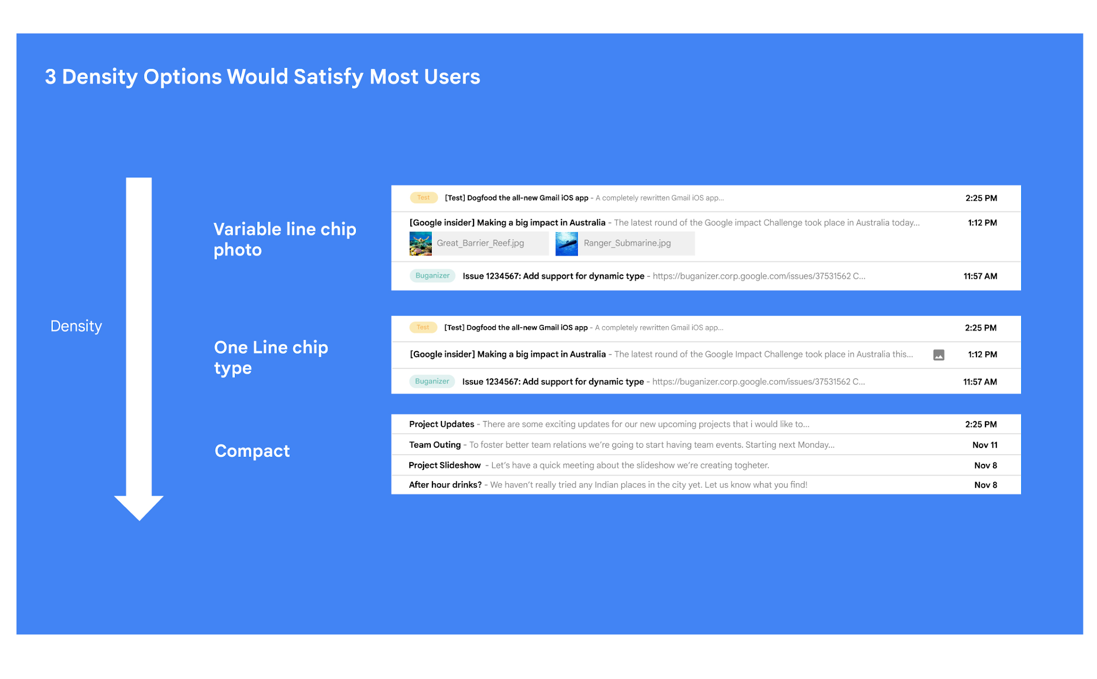
In Gmail you can choose to have fewer messages with a lot of information about each message. Or you can choose to see a larger number of messages with much less information about each message.
It really comes down to your preferences. And it’s one of the reasons why so many users like using Gmail. In fact, being able to set inbox display preferences is actually one of the top 10 most used settings within Gmail.
So you were really trying to give users choice on how they would like their information presented?
MI: Exactly. Now, we could have added 100 different levers so that every user could customize their email feed to an infinite degree. While that is possible from a coding perspective, it’s not practical for three reasons.
First, infinite choice sounds good on paper, but in reality, too many options creates a confusing user experience. Second, development would take many months—maybe even a year. And third, it would be a long-term maintenance nightmare.
So how did you go about doing it? Share with me the inner workings of Gmail in Google Workspace. How is the sausage made?
MI: Well, it came down to four key steps, working closely with our amazing UX Research team.
First came the primary research to find out if building this experience was worth doing. After all, what is the point of building it if no one wants it? For this we actually sat down with real users inside and outside of Google to understand their needs.
Second, we brainstormed 100 potential solutions and narrowed them down to 8 options. Then we mocked up each of the 8 options to see how they looked.

While it would have been easy to just pick the option we liked the most and build it, we wanted to create what our users want, not what we like the most. So we took those options and surveyed the users from step 1 again. We specifically asked them to rank their preferences across three dimensions: Love It, Hate It, or Meh!
Based on the user responses, we realized that 3 configurations would meet the needs of most users. These were the three options we developed and deployed to Google Workplace.

I love how you used data to guide your decision of what to build. This really is Google’s secret sauce—first-hand data collected from users.
MI: Absolutely. Without their feedback, we would have never been able to narrow down to the 3 options that would satisfy most of our users.
Talking about risks: Getting user feedback and validating before you build is one way to de-risk your product, but you even de-risked your product launch strategy, correct?
MI: Yes. Sometimes we launch features individually. Sometimes we launch them as a group. In this particular case, we had a lot of moving parts. We had a complete UI redesign, 10 or 12 new features, and architecture changes.
So to de-risk this, we put in place—I kid you not—a 26-stage launch process. We started off with the technical architecture changes—stuff that the user would not notice—to make sure that it was working. And we did it in small increments.
Then we rolled out a few features at a time, launching it first to our early access program—where users have opted in to receive updates. We measured their reaction and satisfaction first, and then moved on to the next group.
At every stage, we kept our blast radius small and put in these checks and balances where we could launch, measure reaction, and then reassess our strategy. And that worked out pretty well for us for this massive launch.
Agreed! Thank you for taking the time to talk to me. And good luck with building the next version of Gmail.
MI: Thanks for having me.
This interview was originally published on Google Workspace blog

