It’s easy to copy ideas from your competition
A few years ago, we helped a client redesign their customer onboarding experience.
As part of the redesign, the VP wanted to include over 20 “must have” features.
When I asked him the source. He replied that he had copied the best of the best from the competition. And that he wanted the team to add their own twist to it so that they can make it better.
And on the surface it makes sense.
There is no point re-inventing the wheel. Why do all that extra work of coming up with new ideas. Why not copy, tweak, and improve.
It’s a nice way to get a leg up on the competition. Plus it is so much easier.
But should you?
The problem with copying an idea is that there is no guarantee that it is the right feature for your customers.
For two key reasons.
First there is no way to know if the features are having an impact. Just because they look good does not mean that the users use them or value them.
Second, even if it is working for them. Does not mean it will work for you. Your customers needs might be quite different.
So what should you do? How do you find out which features are worth considering?
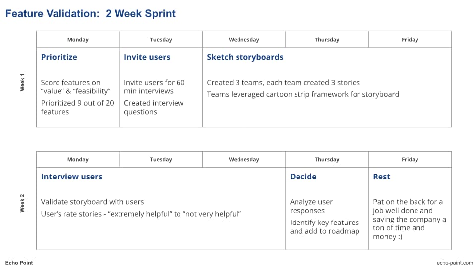
Here is how we helped the above client identify which features are worth taking a second look.

Week 1: Set Up
Prioritized Features:
20 features are a lot to work with, especially on a tight budget.
So we scored the features across 2 key dimensions – “value to the user” and “technical feasibility”. Mapped them on a 2×2 grid, debated like crazy, and eventually cut the list down to 9.
To ensure alignment, we conducted the above exercise with the VP and the entire product team (product, engineering, and UX managers and key SMEs).
Invited Users:
If you want to know what users think, the best way to do so is to ask them.
In our case, since the bank wanted to keep this confidential. We only invited bank employees that fit the user persona description. And were not related to the project.
The team sent out over 25+ invites and over 10 people accepted.
Created Storyboards:
Pictures are worth a thousand words.
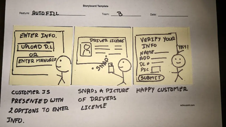
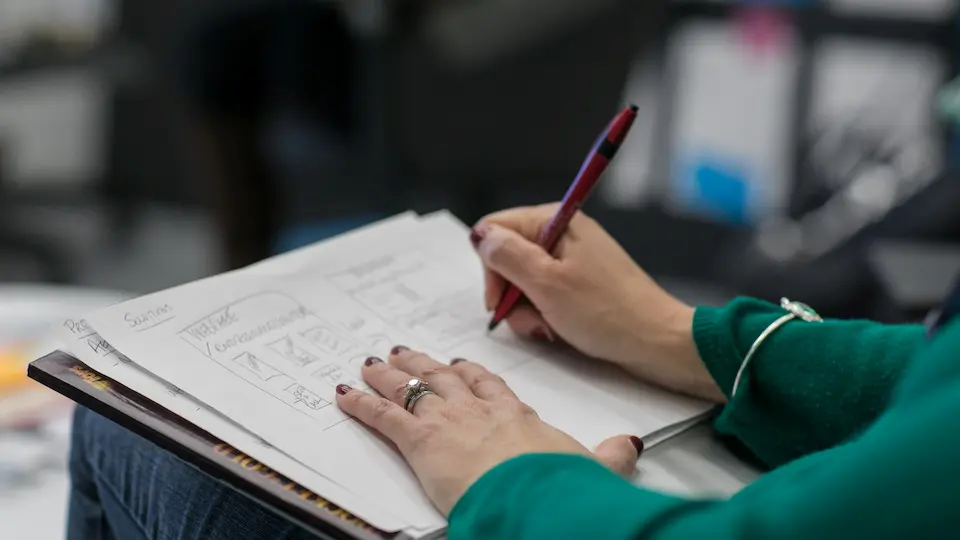
So to make sure we are conveying the right message to the customer. We split the product team into 3 groups, and asked each team to describe the feature using a story board.

Week 2: Validate & decide
Interview Customers:
We shared all 9 storyboards with the users. And asked them the following questions,
- Rank helpfulness of the stories. Across the following 5 dimensions – extremely, very, moderately, slightly, or not at all helpful.
- Why they gave that rating?
- What did they like / dont like?
We only focused on helpfulness in this exercise. Since the goal was to validate if the customer’s needed this solution. Validating the design would come much later, during prototyping.
Synthesize & Decide:
Once we completed the interviews, we collated and analyzed the feedback.
Here is what we found. Of the 9 features, our users ranked only 2 as extremely helpful, 3 as not helpful at all, and the remaining 4 somewhere in the middle.
Based on this data, the team decided to add the 2 extremely + 1 very helpful story into the discovery roadmap.
The above exercise not only helped the team identify the right features to emulate. But also saved them time and money.
The above method may seem un-orthodox. But it is extremely effective.
By including customers in the design process. The team was able to narrow down not just what to build, but also what not to build.
Which ultimately saved them a ton of time and money. That they could then take and re-invest into building other features.
Happy building!!

